…but still believes in Obama.
Here’s a textbook case of the liberal mindset. Jessica Sanford of western Washington state was so happy with the initial Obamacare premiums she was quoted by the state website that she sent off a grateful letter to President Obama which he featured in a speech three weeks ago. But since then, Sanford’s been informed—well, you have to read the Byzantine story for yourself, because it’s still not all that clear how much Sanford will be actually end up paying for herself and her 14-year-old son who has ADHD, because the news keeps changing.
The one constant is that the news is not good. First she was informed her subsidy would be less than she originally was told, but it was still something she thought she could swing. Next she was told no subsidy would be forthcoming at all, because her son had been enrolled in Medicaid and that meant her income level was figured as though she were a single person, which disqualified her for subsidies. Then she was told her son’s Medicaid enrollment could be rescinded if she liked. But that turns out to be difficult to actually accomplish, although one customer in the state of Washington has apparently been able to do it—so there’s hope, right?
Sanford is upset, but it’s clear who she doesn’t blame—President Obama:
I don’t want to be bashing the president. I don’t want to be bashing the ACA. I don’t want to come across as saying that. I’m a big Obama fan.
But to me there’s a big problem with the way the state is handling it. You put your stuff in there and once you do it, it is impossible to do anything…So you are stuck on this big treadmill of bureaucracy, and you know, if feels very out of control.
Yes, it’s the state’s fault, because of course—as everyone knows—the federal bureaucracy is so much homier and cozier, and what’s going on right now in the state of Washington re Obamacare has nothing to do with the feds, nothing at all.
Sanford is really a perfect example of the difficulty of changing a mind and a political affiliation. People often resist making the connections that would cause the feeling of discombobulation that would come from having to give up previous notions of the good and the bad, and the need to change political affiliations as a result.
I’m not surprised by the bureaucracy and the screw-ups she has encountered—or even by Sanford’s tendency to stand by her man and her party. But there’s another part of this story that did astound me, which is that a single woman making $50K a year and having one child would qualify for Medicaid for the child. Here are the rules (I’m not sure whether this is just the way the state of Washington does it, or if these are the rules for any state that has accepted the Medicaid expansion under Obamacare): at up to 200% of poverty level, children are automatically enrolled in Medicaid when the family signs up at the state exchange. From 200% to 250% of family poverty level, children are eligible to do so but enrollment is optional, and the parent must pay premiums of $20 a month per child (capped at $40 per month for total children). From 250% to 300% of poverty level, enrollment is also optional, and premiums are $30 a month per child.
That’s a lot of kids qualifying for Medicaid. Take a look at this chart for the poverty guidelines:
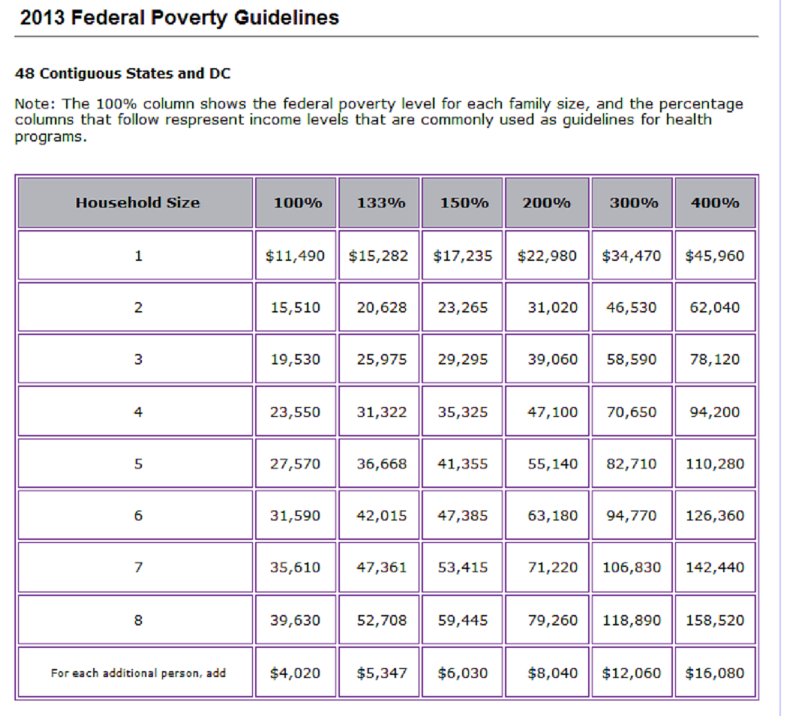
Notice, for example, that a family of four (a couple with two children, let’s say) would be forced to enroll its two children in Medicaid if the couple’s income was under $47,100, and the couple’s own premiums would now be figured as though they were a family of two, which would decrease their subsidies. Using this general calculator for Obamacare, and if the couple were Sanford’s age of 48, a family of four with that income would pay $2964 a year out-of-pocket for silver plan coverage, whereas a family of two with the same income would pay $4488 because their subsidies would be lower based on their higher percentage of poverty level. So by enrolling the children in Medicaid (which would be compulsory), the family loses $1524 a year, at least for premiums (which might be offset by reduced co-pays and deductibles, however; that’s a more complex calculation, because a family under 250% of poverty level gets a reduction in the usual co-pays and deductibles on the exchange plans, as well).
It also means that same family of 4 making up to $70650 a year (300% of poverty level) would be able to enroll its children in Medicaid for a small fee if they so chose. That sort of income for a couple with two children isn’t exactly wealthy, but Medicaid? Of course, Medicaid is such third-class insurance that not many people in the $70K category would willingly choose it—especially since, by taking the Medicaid option for their children, they’d be paying $8580 out-of-pocket for their own insurance (which would now be figured as a couple only) versus the $6708 they’d be paying as a family of four (after subsidies, which they would be eligible for as a family but not as a couple).
One of the many things wrong with Obamacare is that the subsidy structure contains a vast number of inequities such as this. Even if you agree with the basic idea—as Sanford seems to—the anomalies are legion in practice. Some may be intentional but some seem unintentional and random and even perverse. Plus, the complexity is immense, and the opportunities to game the system for those who master that complexity are immense as well. And this is true without even figuring in the similarly vast opportunities for fraud.
Bruce Barcott, who also lives in Washington state and also was a big Obama supporter, got a similarly rude awakening to Sanford’s. Although the details are somewhat different, and he never wrote a letter of thanks to the president that he now has to walk back, he’s unexpectedly much worse off after Obamacare than before.
Barcott has a friend in a similar fix who called a lawyer-accountant for advice and was told this:
I can’t ethically advise you, because honestly I don’t know the right thing to do. Nobody does. There are no answers. Right now it’s a complete clusterfuck.
Now, there’s an honest man.
But unlike Sanford, Barcott is angry at Obama. And he even understands the irony of it:
Once the sound of boiling blood dissipated, in my head I heard my Republican friends chuckling at the sight of a liberal Democrat hoisted ten stories high on his own petard. How’s the view up there, Obamacare Ollie?
One of the interesting things about what’s happening in the individual insurance market is that many of these people are self-employed self-starters, some of them (like Barcott) are freelance writers. They are articulate. And they write. I don’t know whether Barcott’s mugging by Obamacare reality will lead to deeper realizations and changes in his basic political beliefs, but I think with someone like him there’s a chance.