Wow! What a lot of suggestions, much appreciated. However, I realize on reading them that I have more ‘splaining to do. Thus, this post.
(1) I originally thought of course I’d use a photo of the monument on the cover. But I ran into lots of problems, and blurriness was only one of them. I’ve been to the monument, and I’ve also seen many photos of it. The monument and the name can be photographed from a distance that allows you to see it’s a monument by the shape of it, but that distance leads to a problem and the problem is either blurriness or faintness of the letters of the name. These of which can be somewhat corrected, although years ago I visited there with a friend who had a very good camera and lens, and the photos still weren’t very good.
What can’t be corrected, and what is true of all the images I’ve seen of the actual name in the stone, is that visually it’s a rather dull photo with a dull color if the color is true (gray). Unless someone has already read Gerard’s essay “The Name in the Stone” and is already familiar with the story it tells, I don’t think a photo of the monument is all that arresting. It’s kind of bland and colorless, and the color is in a sort of middling range. What’s more, there’s the problem – and believe me, it’s a real problem – of putting letters on top of letters when designing a book cover. That is, when superimposing the text of the title and author on a bunch of other names on gray stone, a cover is created that can be visually confusing. And it’s surprisingly hard to make the letters “pop” against the gray unless you make them chartreuse or something equally Day-Glo, which I don’t find attractive.
And then there’s the whole idea of having a cover with a photo that literally illustrates the meaning of the title. I found, when I actually designed cover after cover of this type, that it started to feel limiting. There are almost 50 essays in the book. Only one – the title essay – is about the name in the stone. But it’s not really about the monument itself, although it most definitely touches on that. It’s more about Gerard’s attitude towards seeing his own name in the stone, his relationship with his family and their memories of his late uncle who died in the war, and his growth as a person from college student to the man writing the essay. And that’s just one essay of so many. Therefore, putting the photo of the monument or other parts of the park such as the eagle sculpture on the book cover started to seem to me as though it would be misleading about the nature of the book’s contents.
As for my going down to New York again and taking photos, it’s not happening. That’s a big trip for me, and as I said, I’ve actually been there before and tried to get good photos, unsuccessfully. Also, such photos probably would have the drawbacks I mentioned. But if any of you want to go there in the next week or two and try to take photos and then send them to me – please, by all means, do so. But I’ll caution you by quoting no less an authority than Gerard’s essay itself, 2007 version. Gerard was a good photographer with excellent cameras. He published the essay many times after that and never indicated that the situation had changed [emphasis mine]:
[The name is] on the far left column on the third stone in on the right side of the monument looking towards the sea. The name is usually in shadow and almost impossible to photograph. …
Note: Since this essay was first written in May, 2003, several thoughtful people have supplied me with photographs. As you can see, the name still remains difficult to photograph.
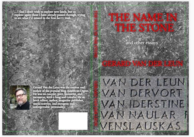
The photo someone sent him is the one I used in that first book cover in Saturday’s post.
It’s also harder than you might think to get something that would work on a book cover in terms of size, shape, sharpness, contrast, and visual attractiveness. I actually already have access to some clearer photos that are neither mine nor Gerard’s, and I didn’t think they’re very successful when I tried designing covers with them just as an experiment. For example, here’s one with a photo from Google Street View. I can put it in this blog post and attribute it (which I just did), but it is not allowed on book covers at all, even with attribution. However, I’m offering it as an illustration of what’s possible if someone went down there and took such a photo (by the way, these cover photos are screenshots of prototype covers but the real covers would have text that looks sharper than this, and the diagonal lines and the words “Book Brush” wouldn’t be there on a real cover, of course):
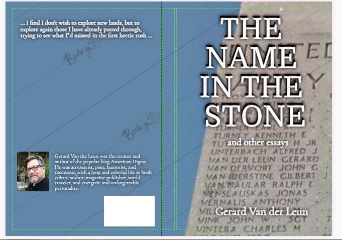
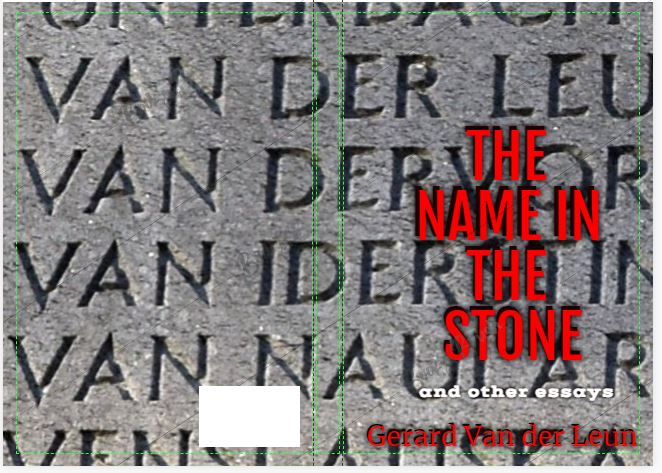
Here are some book cover examples that use a closeup photo from another site. I would also probably need permission if I used this photo on a book cover, and I may or may not be able to obtain that permission. The photo is very clear, but I think it doesn’t integrate all that well into a cover. I’ve tried many composition ideas, as well as fonts and colors, and it just seems dull to me. I think this might be the best of the lot:
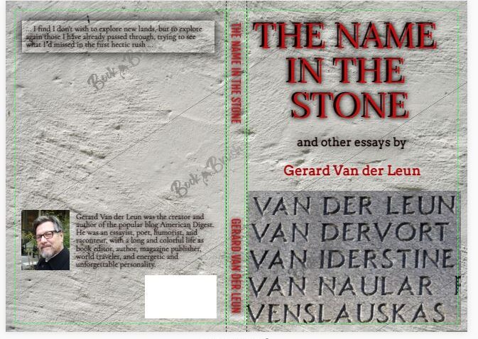
A similar effort of mine; whether better or worse I’m not sure:
This next one uses the same photo but blows it up to be the background for the entire cover, and then superimposes the title, etc., on it. I think it’s visually confusing. Plus, only part of the name is on the front (right) and part on the back (left). I didn’t bother to finish the back cover on this one, but it would be similar to the others where I’ve put some words and a photo on the back. The letters here are red and somewhat 3-D in an effort to make them more visible. I’m not sure I like red, but I discovered that other colors are really hard to see (except the aforementioned Day-Glo ones):
(2) I can find copyrighted photos of the eagle statue at the monument site. But in that case I’d have to pay major bucks to use a photo like that on a cover. The eagle is visually dramatic, and using the eagle would be okay if the book were about war heroes or something like that, but it’s really not for the most part. And, unlike the covers with a photo of the actual name in the stone, the eagle statue doesn’t explain the title unless the reader happens to already know that the sculpture is in the same park as the monument. So using the eagle doesn’t make sense to me. The essays are very varied in nature, as I’ve said and as Gerard’s regular readers are aware – philosophical, humorous, sarcastic, personal stories, spiritual, and expressing awe at nature and the universe. I hope the book appeals to his readers, but I hope to reach a wider audience, too, if possible.
(3) The back of the book as I’ve done it on these book cover ideas is incomplete. The big space between the quote from the book (on the top of the page) and Gerard’s photo and bio (on the page bottom) is for blurbs from other authors, which I plan to try to get. That’s another one of the tasks involved.
(4) The reason the book is subtitled “and other essays,” rather than something like “and other works” or “collected works” is because it is composed only of essays. That’s how Gerard had planned it. As for his poetry, I’m planning to edit a second book containing just his poetry.
(5) There are plenty of fonts and colors available; these are just some ideas. I probably will have a book cover designer help with that. But yes, to answer a question some people had: these days, book covers often mix fonts, including using block print in one part and script in another. Go to any site that has templates and you’ll see (for example, this). I own quite a few older books that do it, too; it’s not just a new fad.
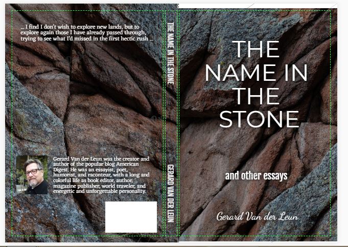
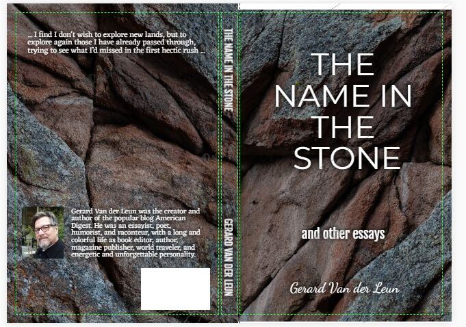
(6) Here’s the other style book cover that quite a few people preferred from the previous post. I really don’t know whether I’ll end up using a monument names photo or something else like this. I go back and forth with it. But I think this one has the advantage of being bold and simple, as well as conceptually open-ended. The photo is also free for use. By “open-ended” I mean that this photo could conjure up almost anything in the mind of the reader: strength, endurance, nature, rock of ages, and probably other things. It’s not THE name in THE stone, of course. But Gerard’s name is on the stone on this cover, if only as an artistic device. So it is at least slightly illustrative of the title without being a literal demonstration of it. Inside the book there will be a photo of the monument with the name, the blurry one, but it won’t be as blurry in the book because it will be considerably smaller. So it’s not as though a photo of the monument won’t be somewhere connected with the book.
(7) All of the photos of covers I’ve posted so far have been for the traditional book version. But here’s a cover idea for an ebook version. What do you think?:

ADDENDUM: For anyone who likes the covers with the “name” photos of the monuments – as I said, there are copyright issues with the first one that are insurmountable; it cannot be used on a cover, period. And there are possible issues with the second, the closeup one. I included them here as examples of what might be done with the right photos, but I have neither the time nor the equipment nor the skill to take any. I hope to get the book out within the next couple of weeks, before the holidays. So really, if anyone is in or near NYC and is a good photographer and wants to give it a try and send me the photo, please do!
The ebook cover, however, has no copyright problems.